图表
3.4.0 新版功能.
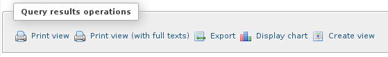
从 phpMyAdmin 3.4.0 版本起,你可以很容易的从 SQL 查询结果中生成图表。只需在“查询结果操作”区域中点击”显示图表”链接。
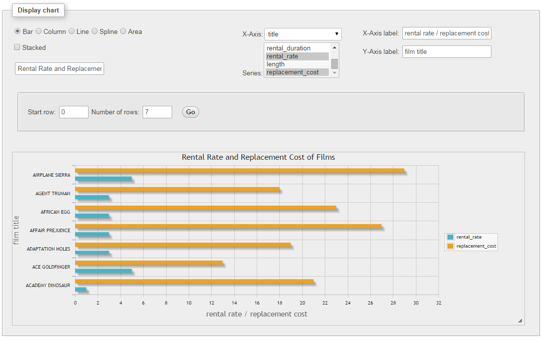
A window layer “Display chart” is shown in which you can customize the chart with the following options.
- Chart type: Allows you to choose the type of chart. Supported types are bar charts, column charts, line charts, spline charts, area charts, pie charts and timeline charts (only the chart types applicable for current series selection are offered).
- X-axis: Allows to choose the field for the main axis.
- Series: Allows to choose series for the chart. You can choose multiple series.
- Title: Allows specifying a title for the chart which is displayed above the chart.
- X-axis and Y-axis labels: Allows specifying labels for axes.
- Start row and a number of rows: Allows generating charts only for a specified number of rows of the results set.
示例
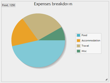
饼状图
可以这样生成查询结果的饼图表示:
SELECT 'Food' AS 'expense',
   1250 AS 'amount' UNION
SELECT 'Accommodation', 500 UNION
SELECT 'Travel', 720 UNION
SELECT 'Misc', 220
查询的结果是:
| expense | 数量 |
|---|---|
| Food | 1250 |
| Accommodation | 500 |
| Travel | 720 |
| Misc | 220 |
Choosing expense as the X-axis and amount in series:
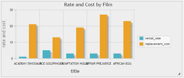
条形图和柱形图
Both bar charts and column chats support stacking. Upon selecting one of these types a checkbox is displayed to select stacking.
Query results for a simple bar or column chart can be generated with:
SELECT
   'ACADEMY DINOSAUR' AS 'title',
   0.99 AS 'rental_rate',
   20.99 AS 'replacement_cost' UNION
SELECT 'ACE GOLDFINGER', 4.99, 12.99 UNION
SELECT 'ADAPTATION HOLES', 2.99, 18.99 UNION
SELECT 'AFFAIR PREJUDICE', 2.99, 26.99 UNION
SELECT 'AFRICAN EGG', 2.99, 22.99
查询的结果是:
| 标题 | rental_rate | replacement_cost |
|---|---|---|
| ACADEMY DINOSAUR | 0.99 | 20.99 |
| ACE GOLDFINGER | 4.99 | 12.99 |
| ADAPTATION HOLES | 2.99 | 18.99 |
| AFFAIR PREJUDICE | 2.99 | 26.99 |
| AFRICAN EGG | 2.99 | 22.99 |
Choosing title as the X-axis and rental_rate and replacement_cost as series:
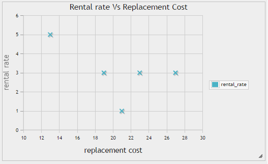
散点图
Scatter charts are useful in identifying the movement of one or more variable(s) compared to another variable.
Using the same data set from bar and column charts section and choosing replacement_cost as the X-axis and rental_rate in series:
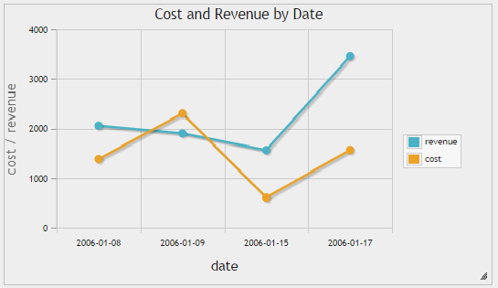
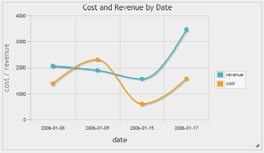
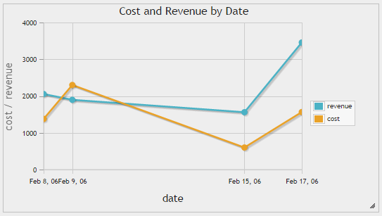
折线图、样条曲线图和时间线图
These charts can be used to illustrate trends in underlying data. Spline charts draw smooth lines while timeline charts draw X-axis taking the distances between the dates/time into consideration.
Query results for a simple line, spline or timeline chart can be generated with:
SELECT
   DATE('2006-01-08') AS 'date',
   2056 AS 'revenue',
   1378 AS 'cost' UNION
SELECT DATE('2006-01-09'), 1898, 2301 UNION
SELECT DATE('2006-01-15'), 1560, 600 UNION
SELECT DATE('2006-01-17'), 3457, 1565
查询的结果是:
| 日期 | 收入 | 花费 |
|---|---|---|
| 2016-01-08 | 2056 | 1378 |
| 2006-01-09 | 1898 | 2301 |
| 2006-01-15 | 1560 | 600 |
| 2006-01-17 | 3457 | 1565 |